


Let’s discuss a problem today that my friend Joey is facing and see if your mobile web design is compatible enough to solve it?
The Problem: Joey is on the wheels and he suddenly remembers that it is his wedding anniversary next week. So, he pulls out his smart phone to search for a perfect gift for his wife and lands up on your website. How are you going to assist him in finding the ideal present in those few minutes till he reaches the airport?
The Solution:Develop a touch screen mobile compatible navigation system that would make it convenient for your customers (including Joey) to locate what they are trying to search on the website.
Amazing! You are thinking along the correct lines. But, what should you do next to make that happen?
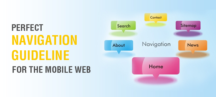
Today, I am going to talk about some of the best practices that would help you to create a perfect navigation system for your mobile web so that it would make life easier for Joey as well as your other mobile users. Be assured that all these tips are equally relevant for the all the responsive designs and mobile websites.
1. Prioritize the Important Pages: Joey doesn’t have much time at hand, so how are you going to assist him to land on the right place quickly? Before you actually get started with creating your navigation design, you need to get answers for some basic questions.
What are the top category pages on your website?
What is it that your mobile using customers most commonly look for on the portal?
Which pages most efficiently satisfy their requirements?
Give your users a direct path to where they need to land and you would make the mobile web experience really amazing for them. Trust me! They won’t have the patience to go through the complicated navigation and you would be left bearing the actions of their impatience where they would just press the ‘Back’ key.
2. Make Your Mobile Navigation Sweet and Short: Joey’s iPhone 5s is only 640 pixels wide in the portrait mode. So, you would have to ensure that your navigation is designed for a screen size as small as that too.
Just ask yourself that what links need to be included in the website to make your mobile users complete their priority tasks? Our recommendation – Limit the mobile web navigation to 4-7 times! Check which elements from desktop navigation would not be as important in the mobile environment and eliminate them.
To keep it shorter and sweeter, you can even consider adding a logo at the top of every page that would navigate the user to the home page instead of adding a separate ‘Home’ tab.
Joey already works really hard, your navigation must not seem as a task to him.
Always write your menu language in such a manner that the user would know what to expect when he clicks on it. Do not let your user to feel mysterious unless you are creating a mobile web for the audience who love anonymous.
Figure out which signs need to be highlighted and where would you need drop down lists to give more options to your users while ensuring that each symbol can be easily differentiated and is self explanatory. The objective here is to make the navigation in such a way that it limits scrolling, thinking and clicking.
Design for Multiple Screen Smart Phone Users
Understand where you need to be identical and where you need to modify when you move from desktop web design to mobile web design.
There are fair chances that Joey would access your website from multiple devices within a short span of time. While you should keep the basic theme, color contrasts and fonts same for all the web version so that the user feel certain about using your web portal from everywhere, make sure that the similarity ends just there!
Be aware about the needs of your mobile web users and limit your navigation for smart phones specifically to the extent of their use and requirement. Remember! With limited space, your users needs also become more specific.
By creating a mobile compatible navigation, you create a user-friendly navigation.
Contact WeDigTech and keep Joey and all your other mobile web users satisfied and increase the chances of conversion by getting them to move in right direction while they are on your mobile web.


